You will find that numerous exercises in this manual will require graphs. Microsoft Excel is a spreadsheet program that can create fourteen types of graphs, each of which have from two to ten different formats. This results in a maze of possibilities. There are help screens in Excel; however, this overview is covers the type of graph you should include in your lab reports. This is meant to be a brief introduction to the use of Microsoft Excel for graphing scientific data. If you are acquainted with Excel already, you should still skim through this appendix to learn about the type of graph to include in reports.
Step 1. Input your measurements and highlight the data using your cursor.
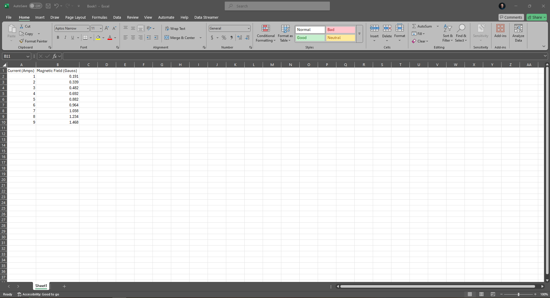
Figure 1:Data entered as columns in Excel.
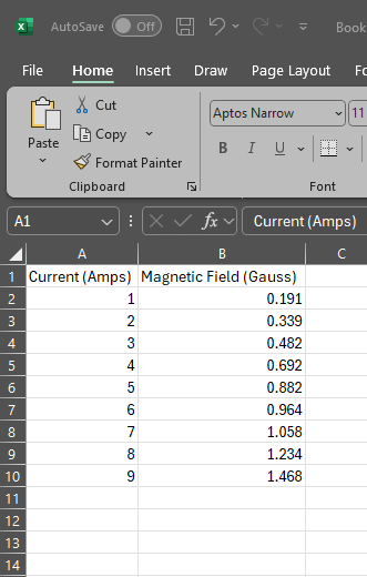
Figure 2:A zoomed in view of column data in Excel.
Use your mouse to highlight the two columns of data. The horizontal (x-axis) will be the left column. The vertical (y-axis) will be the right column. Be sure you put your data in the spreadsheet so that the correct data is on the correct axis.
Step 2. Click on “Insert” on the toolbar.
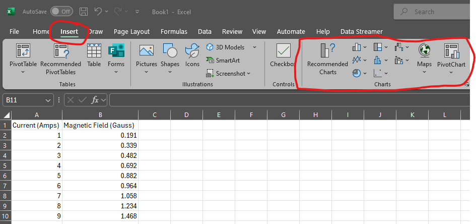
Figure 3:The Insert menu offers graphing options.
Step 3. Choose XY Scatter, not Line, from the list and click the “Next” button.
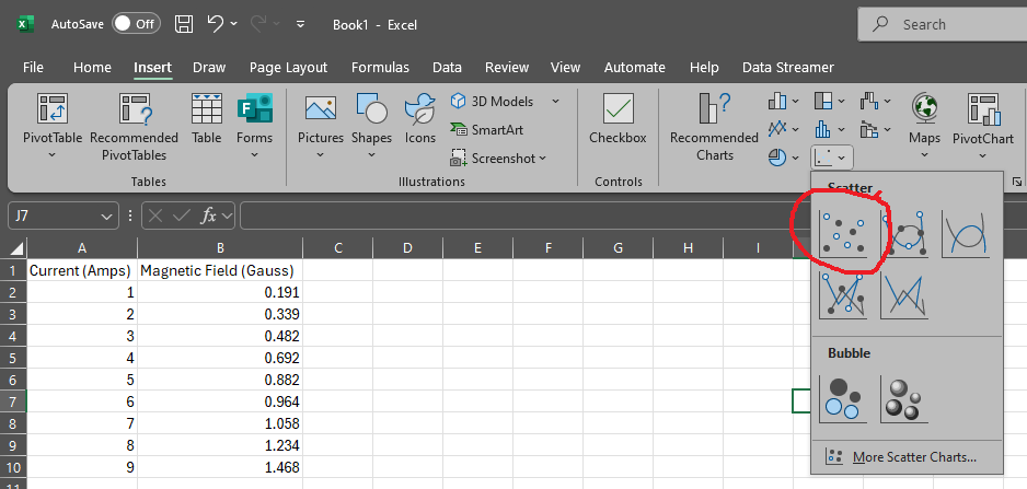
Figure 4:The scatter plot icon is circled in red.
The graph will be created.
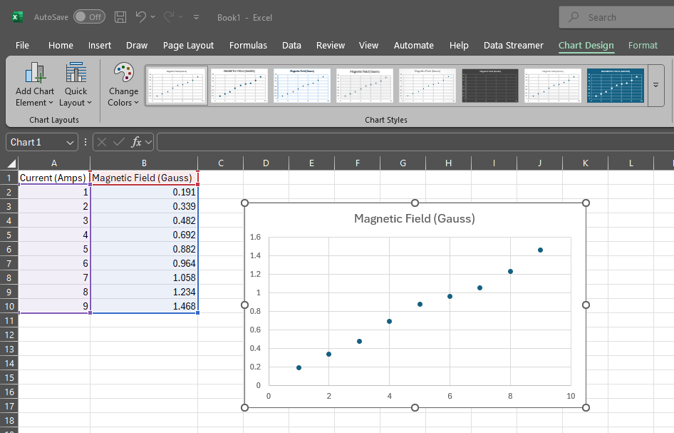
Figure 5:A scatter plot of data.
Step 4. Label your graph axes.
Click on the “Chart Design” Menu.
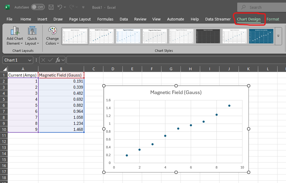
Figure 6:Add elements to your graph with the Chart Design menu.
This will bring up “Add Chart Element” on the upper right. Click this menu and select “Axis Titles > Primary Horizontal”. Type a title for the x-axis. Repeat this process for the Primary Vertical (y-axis). Be sure to include the units of the measurement.
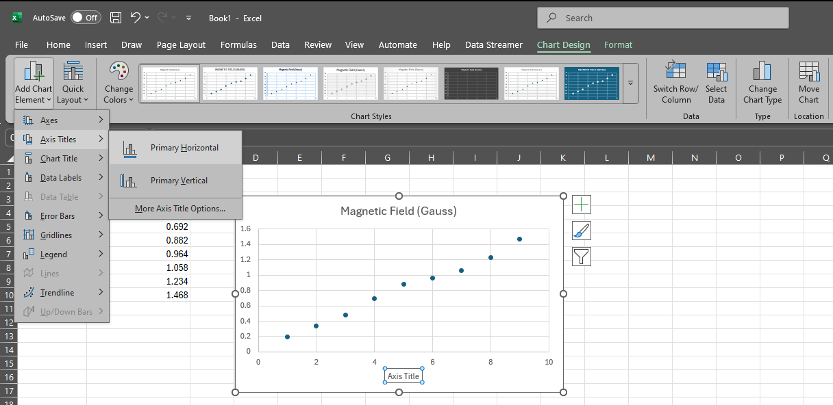
Figure 7:Add labels to your graph axes.
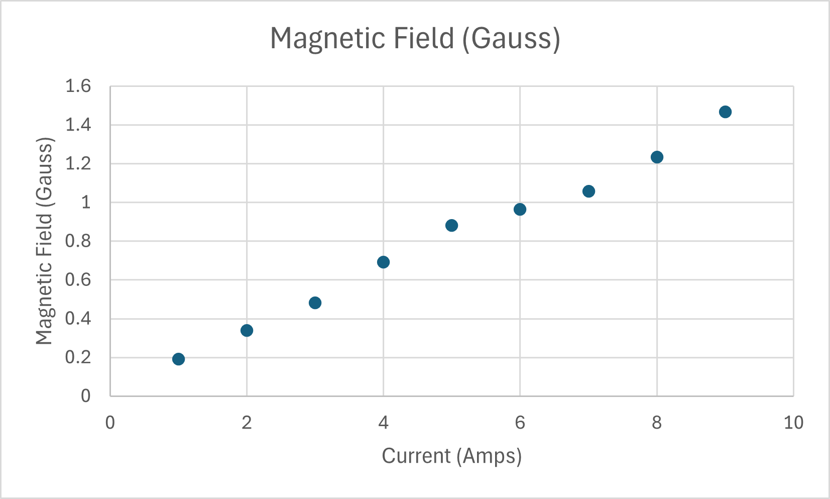
Figure 8:A graph with labeled axes.
Step 5. Select “Add a Trendline” from the “+” menu.
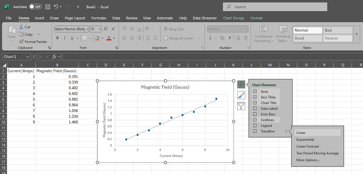
Figure 9:A graph with a linear trendline.
Notice there are lots of mathematical functions you can choose from. Select “Linear”.
Step 6. The trend line will appear – is it a good fit to your data?
Select the “More Options...” menu from the “Add Trendline” menu. Scroll to the bottom of the panel that appears on the right side of the screen. Select “Display Equation on chart”.
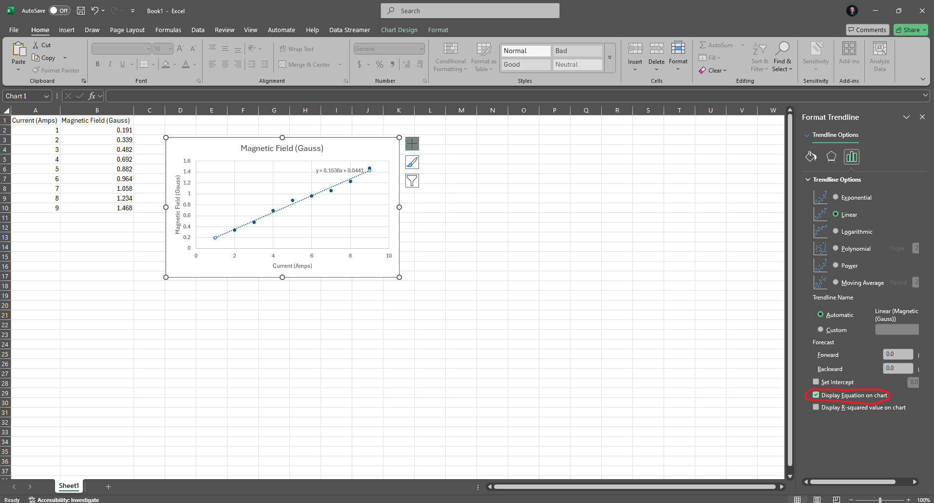
Figure 10:A graph with a linear trendline and the equation of the trendline that best fits to your data.
A finished graph will look something like the following where there is data, axis labels, a trendline, and a trendline equation.
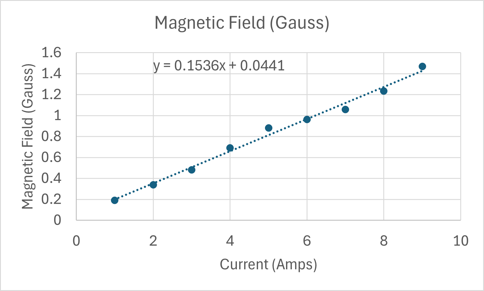
Figure 11:A complete graph with a linear trendline and the equation of the trendline that best fits to your data.